Home / JSON Structure / uiTypes
- uiTypes
- quote
- error
- section
- multipleSection
- tableSection
- tabSection
- group
- text
- textArea
- richTextArea
- select
- date
- link
- button
- integrationButton
- multipleSectionIntegrationButton
- workflowButtons
- toggler
- heading
- hidden
- money
- moneySelect
- moneyTable
- currency
- number
- decimal
- radios
- checkboxes
- endorsements
- multipleSectionEndorsements
- client
- user
- entity
- container
- googleLookUp
- value
- modal
- spreadsheet
- policyNumber
- ratingRules
uiTypes
{info.fa-info-circle} The examples for uiTypes are just extractions from other schemas for reference only. You cannot just copy and paste the extraction into the empty schema and expect it to fully work.
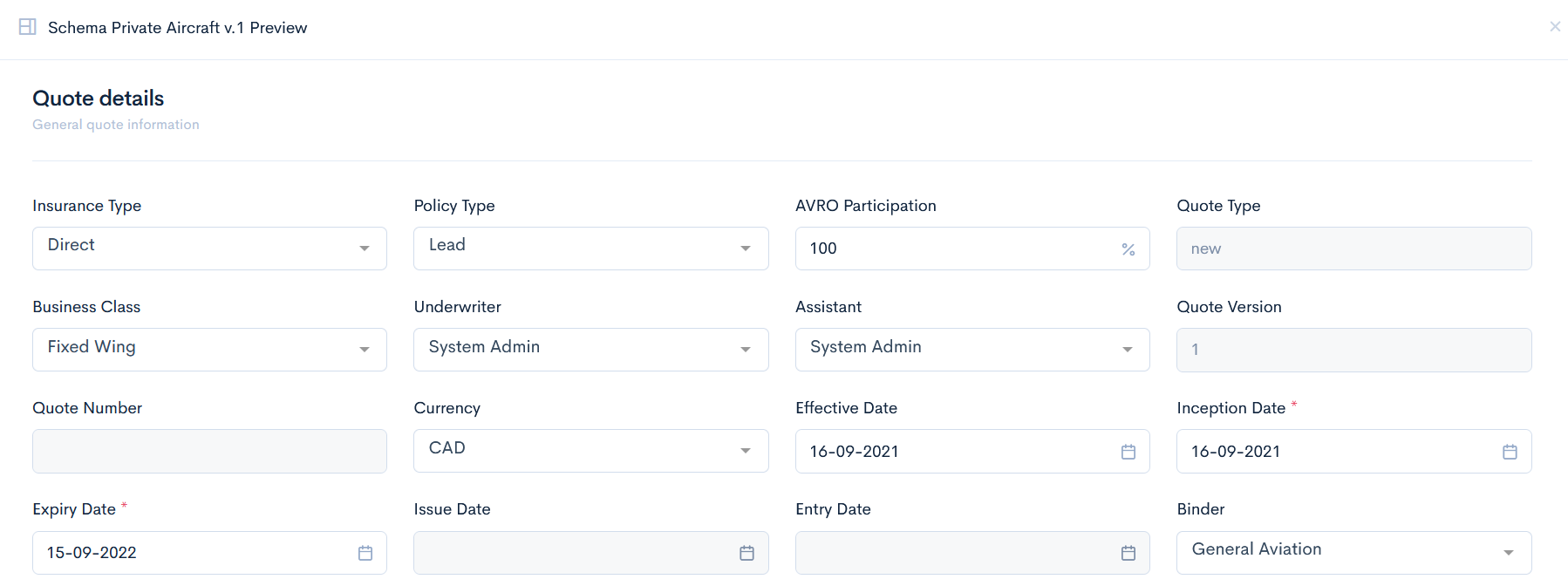
quote
A top level element, which converts the whole JSON code to a quote. It is always written in the index.json file.
Example
{
"label": "Private Aircraft",
"version": "1.0",
"uiType": "quote"
}
Preview
This uiType will output any quote you will create.
error
This uiType is a fallback for the incorrectly provided types. Can not be used in a form.
No preview or example available.
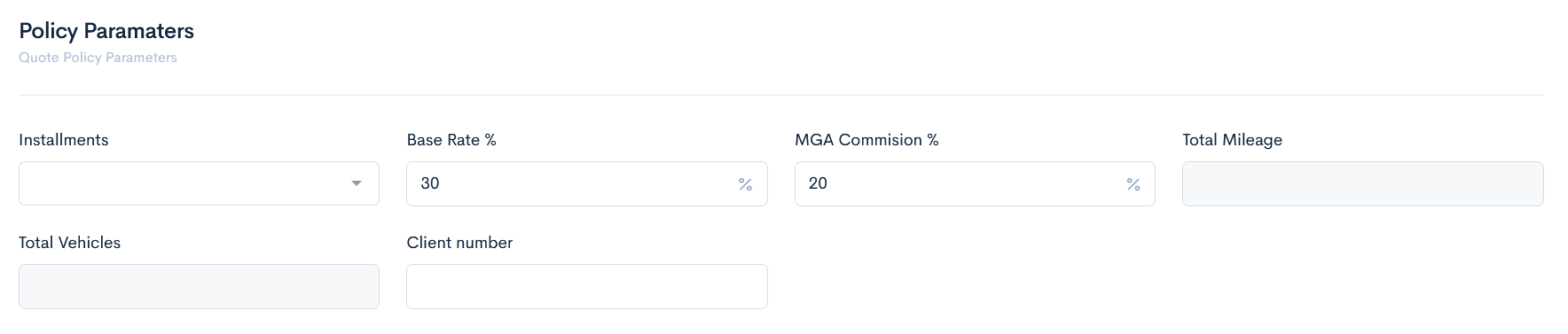
section
This type is used as a container for other uiTypes and their properties/options. It defines a particular section of a quote, which groups together other elements (such as fields).
Example
{
  "type": "object",
  "uiType": "section",
  "label": "Policy Paramaters",
  "description": "Quote Policy Parameters"
}
Preview
This uiType groups the fields, shown below.
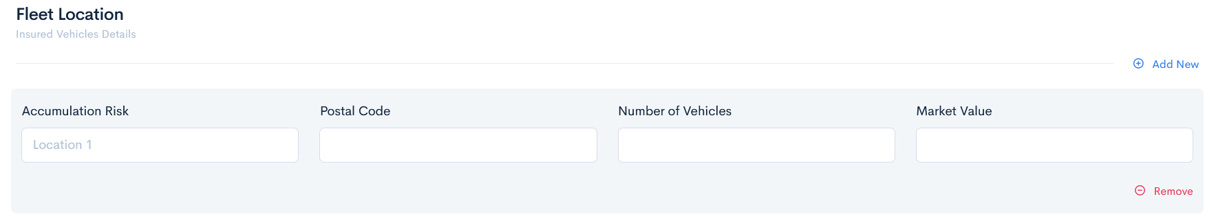
multipleSection
A container that stores a defined object as array.
Example
{
  "type": "object",
  "uiType": "multipleSection",
  "label": "Fleet Location",
  "description": "Insured Vehicles Details",
  "properties": {
    "accumulation": {
      "label": "Accumulation Risk",
      "uiType": "text",
      "uiOptions": {
        "placeholder": "Location 1",
        "class": "col-3"
      }
    },
  }
Preview
This uiType allows to add multiple rows of the same fields in a quote.
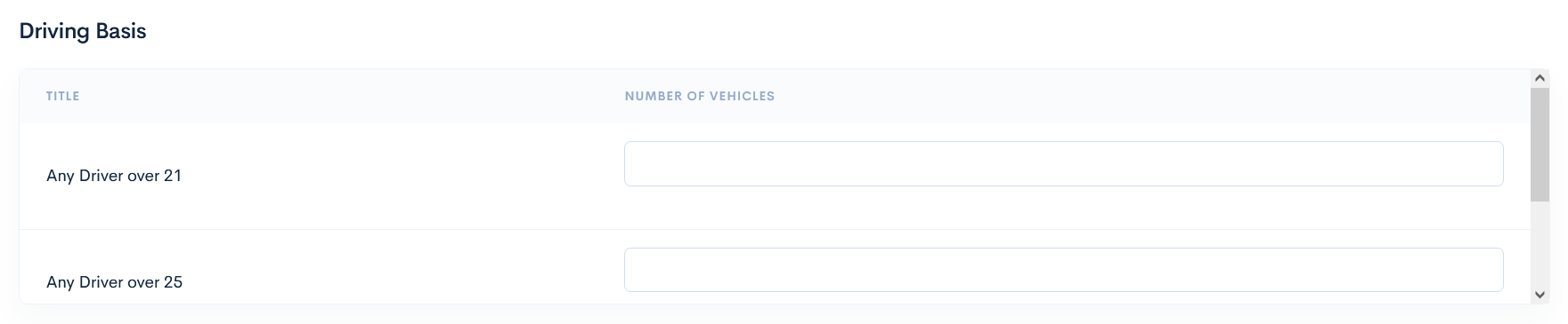
tableSection
This uiType is used as a container in a table format. It defines the table as a separate section. Columns are defined through uiProperties and rows through properties. Not available for specifying single field properties or options.
Example
{
  "type": "object",
  "uiType": "tableSection",
  "label": "Driving Basis",
  "uiProperties": {
    "columns": [
      {
        "title": "Number of Vehicles",
        "column": "numberVehicles"
      }
    ]
  },
  "properties": {
    "over21": {
      "label": "Any Driver over 21",
      "uiType": "number"
    },
    "over25": {
      "label": "Any Driver over 25",
      "uiType": "number"
    },
    "over30": {
      "label": "Any Driver over 30",
      "uiType": "number"
    }
  }
}
Preview
This uiType allows to create a table with fields.
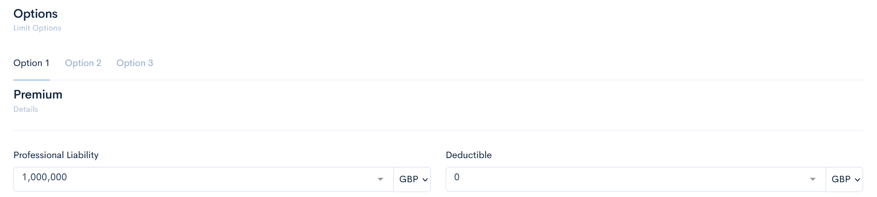
tabSection
Used when quote forms are very long and it is needed to group sections visually into separate pages(tabs). Each tab contains different sets of other elements.
Example
{
  "type": "object",
  "uiType": "tabSection",
  "label": "Options",
  "description": "Limit Options",
  "properties": {
    "option1": {
      "label": "Option 1",
      "uiType": "tab",
      "properties": {
        "option1": {
          "$ref": "option1.json"
        }
      }
    },
    "option2": {
      "label": "Option 2",
      "uiType": "tab",
      "properties": {
        "option2": {
          "$ref": "option2.json"
        }
      }
    },
    "option3": {
      "label": "Option 3",
      "uiType": "tab",
      "properties": {
        "option3": {
          "$ref": "option3.json"
        }
      }
    }
  }
}
Preview
This uiType creates some tabs, in which different large information can be accessed.
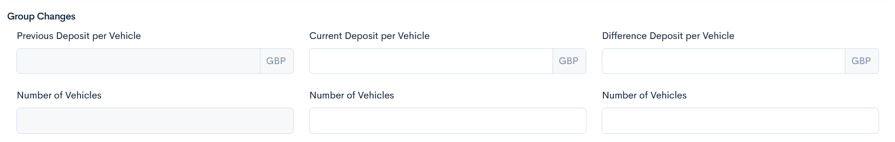
group
The same functionality as section, has only visual differences. Groups a set of fields into a visible group.
Example
{
  "type": "object",
  "uiType": "group",
  "label": "Group Changes",
  "properties": {
    "previousannualBasePremium": {
      "label": "Previous Deposit per Vehicle",
      "uiType": "money",
      "uiOptions": {
        "quoteCurrency": true,
        "class": "col-4",
        "precision": 2,
        "readonly": true
      },
    }
  }
}
Preview
This uiType gathers fields in a group, and has a smaller heading than a section.
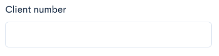
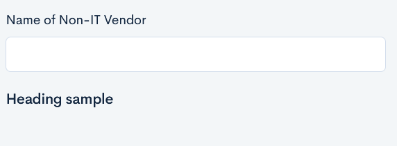
text
A simple text field element where you can type in some information in a few words. Field size can be changed.
Example
{
"clientNumber": {
  "label": "Client number",
  "uiType": "text",
  "uiOptions": {
    "class": "col-3"
  }
},
}
Preview
This uiType shows an empty text field.
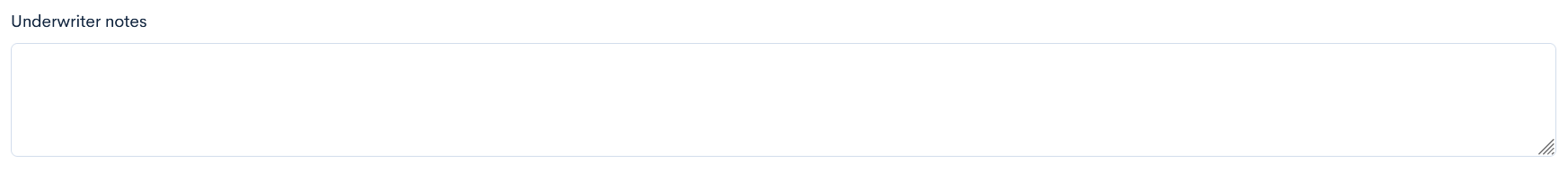
textArea
A text field element used for larger texts. Field size can be changed.
Example
{
  "notes": {
    "label": "Underwriter notes",
    "uiType": "textArea",
    "uiOptions": {
      "class": "col-12"
    }
  },
}
Preview
This uiType shows an empty big text field.
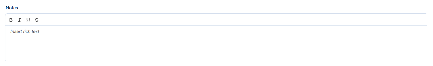
richTextArea
A text field, where text can be formatted.
Example
{
  "notes": {
      "label": "Notes",
      "uiType": "richTextArea",
      "uiOptions": {
        "class": "col-12"
      },
      "uiProperties": {
        "height": "160px",
        "editorOptions": {
          "placeholder": "Insert rich text",
          "modules": {
            "toolbar": [
              [
                "bold",
                "italic",
                "underline",
                "strike"
              ]
            ]
          }
        }
      }
  }
}
Preview
This uiType shows a text field with formatting options.
select
A dropdown element where user can select predefined options of the field. Options are defined in array.
Example
{
  "carBand": {
    "label": "Car & Van Band",
    "uiType": "select",
    "default": "N/A",
    "options": [
      "Low",
      "Mid",
      "High",
      "N/A"
    ],
    "uiOptions": {
      "class": "col-3"
    }
  },
}
Preview
This uiType shows a drop-down list.
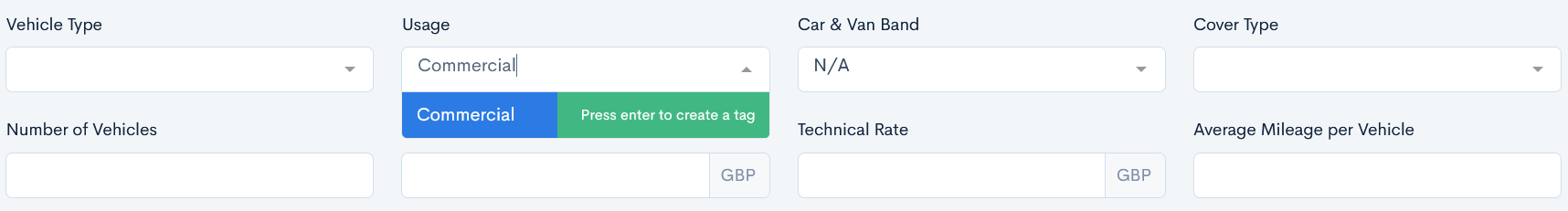
tag
A field that has a dropdown element with an ability to add a new option by typing in the field of a quote. Options are defined in array.
Example
{
  "usage": {
    "label": "Usage",
    "uiType": "tag",
    "options": [
      "Class 1",
      "Class 2",
      "Class 3",
      "Blue Light",
      "Courier",
      "Hazardous Goods",
      "Hire and Reward",
      "Own Goods",
      "Ridehailing",
      "Agricultural"
    ],
    "uiOptions": {
      "class": "col-3"
    }
  },
}
Preview
This uiType allows to enter a new value. Press Enter to save the value.
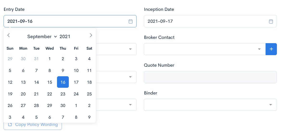
date
A calendar widget, where you can select a specific date.
Example
{
"entryDate": {
  "label": "Entry Date",
  "uiType": "date",
  "uiOptions": {
    "class": "col-4",
    "quoteField": "issue_date"
  },
  "uiRules": [
    {
      "trigger": "onLoad",
      "action": "setToday",
      "target": "quote.entryDate"
    }
  ]
}
}
Preview
This uiType allows you to select a date.
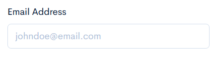
A field to enter an email. The separate uiType is needed to gather email addresses to an email sending form when sending emails from quote.
Example
{
"email": {
  "label": "Email Address",
  "uiType": "email",
  "uiOptions": {
    "placeholder": "johndoe@email.com",
    "class": "col-3",
    }
  },
}
Preview
This uiType displays email field.
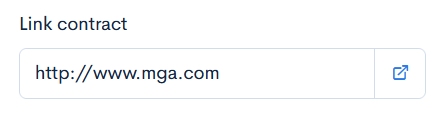
link
Creates a text box where a link to an external page can be entered.
Example
{
  "url": {
    "label": "Link contract",
    "uiType": "link",
    "default": "http://www.mga.com",
    "uiOptions": {
      "class": "col-3 offset-right-9"
    }
  }
}
Preview
This uiType displays link field.
button
Creates a button, which is used to call an action in a quote.
Example
{
  "submit": {
    "label": "Save Quote",
    "uiType": "button"
  },
}
Preview
This uiType shows a button with label on it:

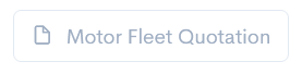
integrationButton
A button that is used to call a specific API integration. Here the default type should be used, which defines the integration name.
Example
{
"buttonQuotation": {
  "label": "Motor Fleet Quotation",
  "default": "quotationDoc",
  "uiType": "integrationButton",
  "uiOptions": {
    "icon": "fe fe-file",
    "class": "btn-outline-secondary",
    "status": {
      "only": [
        "enquiry",
        "progress"
      ]
    }
  }
}
}
Preview
This uiType shows a button with an API intgeration name on it. If the button is available only in one of the quote statuses, then it will be muted.
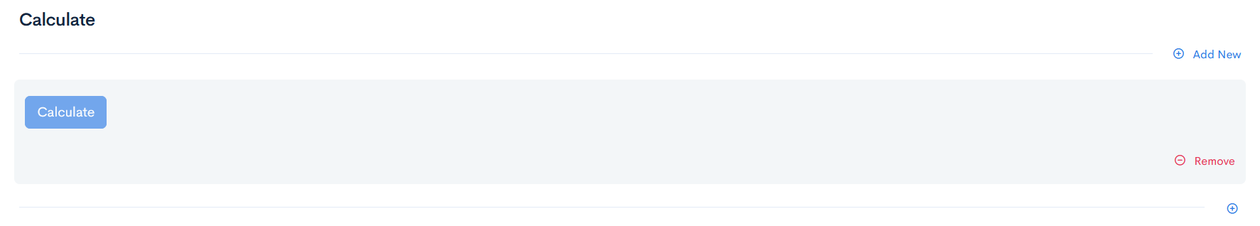
multipleSectionIntegrationButton
A button that is used to call a specific API integration from a multisection row.
Example
{
  "type": "object",
  "uiType": "multipleSection",
  "label": "Calculate",
  "properties": {
    "buttonIntegration": {
      "label": "Calculate",
      "uiType": "multipleSectionIntegrationButton",
      "uiOptions": {
        "integration": "quotationDoc"
      }
  }
}
}
Preview
This uiType lets to add a button in a multisection row.
workflowButtons
Add buttons to change quote status depending on the workflow.
Example
{
  "workflowButtons": {
    "uiType": "workflowButtons",
    "uiOptions": {
      "class": "col-3"
    }
  }
}
Preview
This uiType will show different transition buttons depending on the current quote status.

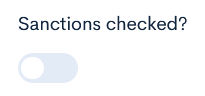
toggler
A swticher, that is used to enable/disable an element. Possible default options are true or false.
Example
{
  "sanctions": {
    "label": "Sanctions checked?",
    "uiType": "toggler",
    "uiOptions": {
      "class": "col-3"
    }
  },
}
Preview
This uiType shows the toggle button.
heading
This element gives a simple heading.
Example
{
  "type": "object",
  "label": "uiType - heading",
  "uiType": "section",
  "properties": {
    "heading": {
      "label": "Heading sample",
      "uiType": "heading",
      "uiOptions": {
        "class": "col-12"
      }
    }
  }
}
}
Preview
hidden
This element is not visible in the quote form, but stores values received from API.
No preview available.
Example
{
"type": "object",
"label": "uiType - hidden",
"description": "Field is not visible because it is hidden!",
"uiType": "section",
"properties": {
"hidden": {
"label": "Hidden field",
"uiType": "hidden"
}
}
}
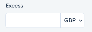
}money
Field, that stores money values with currency code.
Example
{
  "excess": {
    "label": "Excess",
    "uiType": "money",
    "uiOptions": {
      "class": "col-2"
    }
  },
}
Preview
This uiType shows a field with a possibility to select currency.
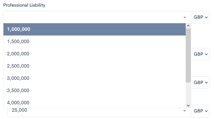
moneySelect
Field, that stores money values with currency code and additionally has some already predefined options to select from. Options are stored in array.
Example
{
  "professionalLiability": {
    "label": "Professional Liability",
    "uiType": "moneySelect",
    "default": "1000000",
    "uiProperties": {
      "step": 500000,
      "from": 1000000,
      "to": 5000000
    },
    "uiOptions": {
       "class": "col-6"
    }
  },
}
Preview
This uiType shows a selectable field with money amount.
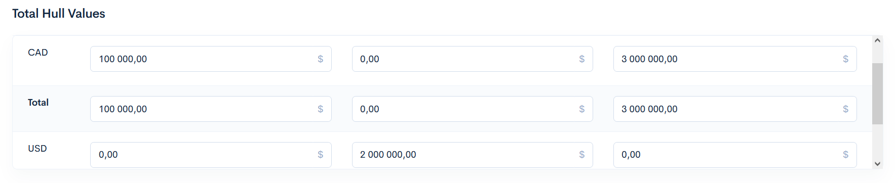
moneytable
Displays multiple monetary amounts within one quote (as a table).
Example
{
  "type": "object",
  "uiType": "moneyTable",
  "label": "Total Hull Values",
  "uiProperties": {
    "columns": {
      "wheelValue": {
        "label": "Wheel Value",
        "method": "sum",
        "rows": {
          "wheelValue": {
            "key": "aircraftdetails.{0}.wheelValue",
            "readonly": false
          }
        }
      },
      "skiValue": {
        "label": "Ski Value",
        "method": "sum",
        "rows": {
          "ski": {
            "key": "aircraftdetails.{0}.skiValue",
            "readonly": false
          }
        }
      },
      "floatValue": {
        "label": "Float Value",
        "method": "sum",
        "rows": {
          "float": {
            "key": "aircraftdetails.{0}.floatValue",
            "readonly": false
          }
        }
      }
    }
  }
}
Preview
This uiType displays table for multiple currencies.
moneyCurrency
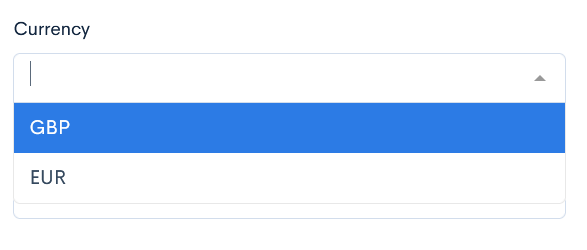
currency
Defines the default currency of the whole quote.
Note: To use this uiType, firstly you have to define "uiOptions": "quoteCurrency" in the money uiType.
Example
{
  "currency": {
    "label": "Currency",
    "uiType": "currency",
    "default": "cad",
    "uiOptions": {
      "class": "col-4"
    }
  },
}
Preview
This uiType allows to select the currency.
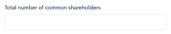
number
Field, that stores only numbers (integers).
Example
{
  "totalShareholders": {
    "label": "Total number of common shareholders",
    "uiType": "number",
    "uiOptions": {
      "class": "col-4"
    }
  },
}
Preview
This uiType shows simple field, where only number can be entered.
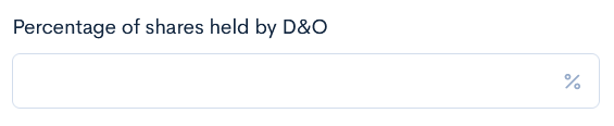
decimal
Field, that can store a float type number, in addition to the integer.
Example
{
  "sharesHeld": {
    "label": "Percentage of shares held by D&O",
    "uiType": "decimal",
    "uiOptions": {
      "class": "col-4",
      "icon": "fe fe-percent"
    }
  },
}
Preview
This uiType shows simple field, where only decimal number can be entered.
radios
A list of buttons, where only one value can be selected. Options are defined in array.
Example
{
  "conventional": {
  "label": "Conventional",
  "uiType": "radios",
  "default": "Conventional",
  "options": [
    "Conventional",
    "Non-Conventional"
  ],
  "uiOptions": {
    "class": "col-4"
    },
},
}
Preview
This uiType shows as many radios, as you define.

checkboxes
This uiType creates checkboxes, where multiple values can be selected. Options are defined in array.
Example
{
  "eao": {
    "label": "Currently Have E&O?",
    "uiType": "checkboxes",
    "default": "No",
    "options": [
      "Yes",
      "No"
    ],
    "uiOptions": {
      "class": "col-3"
    }
  }
}
Preview
This uiType shows as many checkboxes as you define.

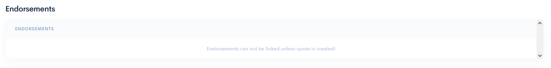
endorsements
In this uiType it is possible to define endorsements for the quote. The following uiProperties are applicable:
-
library- this is a reference to the Endorsement library.
Type: string
Default value: (empty) -
defaultEndorsements- adds default endorsements, when the quote is saved.
Type: string
Default value: (empty) -
editAllowed- allows to edit the endorsement record text, which is already assigned to the quote.
Type: boolean
Default value: true -
customAllowed- allows to enter directly into the quote some custom endorsements, which are not predefined in the library.
Type: boolean
Default value: true -
linkAllowed- allows to link some custom endorsements, that are already predefined in the library.
Type: boolean
Default value: true
Example
{
  "endorsements": {
    "label": "Endorsements",
    "uiType": "endorsements",
    "uiProperties": {
      "library": "RTEC"
    }
  },
}
Preview
This uiType ouputs a field for showing info from the endorsements library.
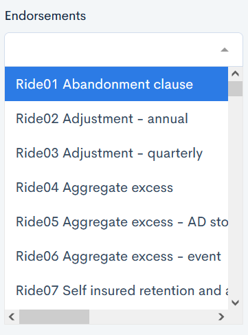
multipleSectionEndorsements
This uiType is very similar to [select]{#select} but instead of options, it requires the user to specify which quote endorsements section values will be available to select from.
Example
{
"endorsementsSelect": {
  "label": "Endorsements",
  "uiType": "multipleSectionEndorsements",
  "uiProperties": {
    "sections": [
      "fleetendorsements"
    ]
  },
  "uiOptions": {
    "class": "col-3"
  }
},
The fleetendorsements is the section key name, which gathers the endoresements library:
{
  "fleetendorsements": {
    "label": "Fleet Endorsements",
    "uiType": "endorsements",
    "uiProperties": {
      "library": "Ride"
    }
  },
}
Preview
You can select from multiple endorsements sections.
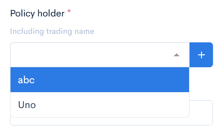
client
A field that allows the user to select the client from the CRM, or enter a new one.
Note: By using the uiMapping keyword, you can copy clients information to the specific fields in the quote.
Example
{
  "policyHolder": {
    "label": "Policy holder",
    "description": "Including trading name",
    "uiType": "client",
    "uiMapping": {
      "proposer.house": "address.building",
      "proposer.registrationNumber": "company_registration_code",
      "proposer.occupation": "occupation_code",
      "proposer.street": "address.street",
      "proposer.town": "address.town",
      "proposer.county": "address.county",
      "proposer.postalCode": "address.post_code",
      "proposer.phone": "phone",
      "proposer.email": "email",
      "proposer.web": "website",
      "proposer.clientName": "legal_name"
    },
    "uiOptions": {
      "required": true,
      "quoteField": "client_id",
      "class": "col-3"
    }
  },
}
Preview
This uiType shows a selectable field with clients names.
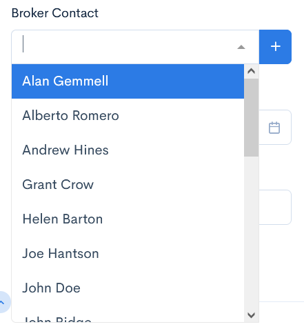
user
A field that allows you to select the user from the CRM, or create a new one.
Example
{
  "brokerageContact": {
  "label": "Broker Contact",
  "uiType": "user",
  "options": "brokers",
  "uiOptions": {
    "class": "col-4"
  }
}
}
Preview
This uiType shows a selectable field with users names.
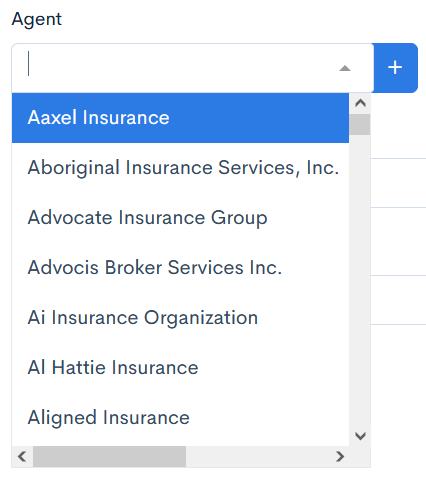
entity
A field that allows you to select the entity from the CRM, or create a new one.
Example
{
"agent": {
  "label": "Agent",
  "uiType": "entity",
  "options": "entities",
  "uiOptions": {
    "class": "col-3"
  },
  "uiProperties": {
    "type": "agent"
  }
}
}
Preview
This uiType shows a selectable field with entities.
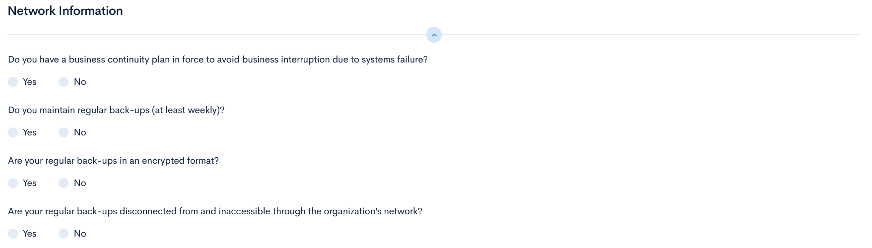
container
Element that gathers fields into one group without any visual changes. It can be used for some specific functionalities as uiRules, to hide the whole block in one step.
Example
{
  "properties": {
    "sme": {
      "uiType": "container",
      "properties": {
        "continuity": {
          "label": "Do you have a business continuity plan in force to avoid business interruption due to systems failure?",
          "uiType": "radios",
          "options": [
            "Yes",
            "No"
          ],
          "uiOptions": {
            "class": "col-12"
          }
        },
        "regularBackups": {
          "label": "Do you maintain regular back-ups (at least weekly)?",
          "uiType": "radios",
          "options": [
            "Yes",
            "No"
          ],
          "uiOptions": {
            "class": "col-12"
          }
        },
}
Preview
This uiType does not make any visual changes.
googleLookUp
This element uses Google Maps for easier address findings.
Note: This uiType will work only if the instance has the Google Places API key.
No preview available.
Example
{
"properties": {
"entryDateAddress": {
"uiType": "googleLookUp",
"label": "Address",
"uiOptions": {
"class": "col-6"
}
}
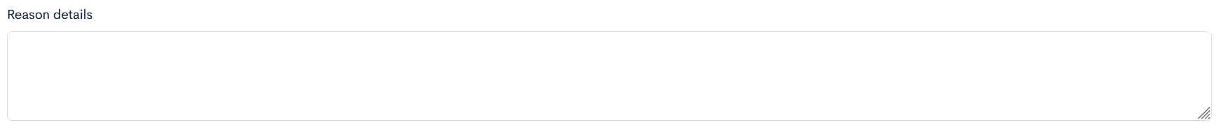
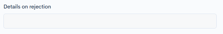
}value
This uiType is readonly, it contains or links some values from other fields.
Example
"rejectedDetails": {
  "label": "Details on rejection",
  "uiType": "value",
  "uiOptions": {
    "class": "col-6",
    "readonly": true
  },
  "dependable": {
    "target": "rejectedReason.rejectedDetails"
  }
  }
}
Preview
This uiType will take the value from the Reason Details field and transfer it to the Details on rejection field.
modal
It is a popup that is shown when a specific workflow button is activated. The following example shows that when a termination button is clicked, a new window will appear, where you will have to select the termination reason.
No preview available.
Example
{
  "type": "object",
  "uiType": "modal",
  "label": "Termination Reason",
  "uiProperties": {
    "modalClass": "modal-sm"
  },
}
spreadsheet
The logic is the same as in multipleSection, but visually it looks like a spreadsheet.
Example
{
  "label": "Please Provide Pilot Details Below:",
  "uiType": "spreadsheet",
  "uiProperties": {
    "colWidths": 150,
    "tableHeight": 300
  },
  "properties": {
    "pilotName": {
      "label": "Pilot Name",
      "uiType": "text"
    },
    "age": {
      "label": "Age",
      "uiType": "text"
    },
    "totalTime": {
      "label": "Total Time",
      "uiType": "text"
    },
}
Preview
This uiType shows a section in a spreadsheet form.

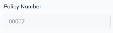
policyNumber
This uiType creates a field with automatically generated policy number when the quote is issued.
Note: You have to define the status limitations to make the uiType work.
Example
{
"policyNumber": {
  "label": "Policy Number",
  "uiType": "policyNumber",
  "uiOptions": {
    "class": "col-3",
    "quoteField": "policy_number",
    "policyWritableField": true,
    "status": {
      "only": [
        "bound",
        "issued",
        "cancelled"
      ]
    }
  }
}
}
Preview
This uiType shows the generated policy number, when the quote is issued.
ratingRules
A block that lists all the notes, messages returned from the rating engine. Each rule provides visual highlight and a tooltip message to fields in the quote that match keys values from the rating engine.
No preview available.
Example
{
  "type": "object",
  "uiType": "ratingRules",
  "label": "Rating Rules",
  "description": "Rating Rules details",
  "uiOptions": {
    "collapsable": true
  },
  "uiProperties": {
    "messages": {
      "decline": "Calculation has triggered decline rules",
      "refer": "Calculation has activated referal rules"
    }
  }
  "properties": []
}
}